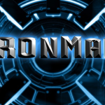
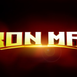
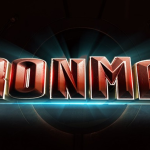
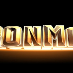
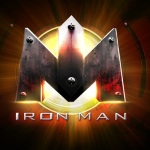
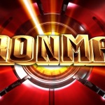
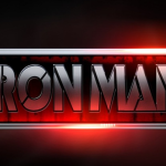
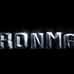
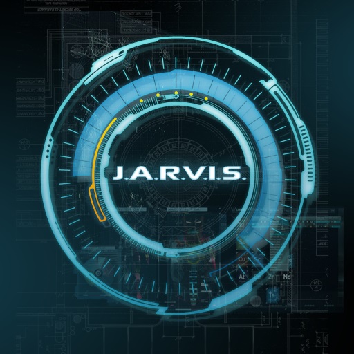
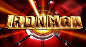
 “Every time you see a logo for anything, whether it be on a soda can or a movie poster, you are looking at the result of a lot of hard work. Specifically, you’re looking at a design that was reached over time, with a designer and a company going back and forth until they reach a final goal. Any official movie logo is only one of dozens that was created. For those who like to see how this particular portion of the movie sausage is made, a new interview with artist Fede Ponce should prove enlightening … especially when you see how many of his ideas for the Iron Man logo didn’t make the final cut.
As a freelance creative director, Ponce designed several logos for Marvel Studios, including the first Iron Man movie and Thor: The Dark World. In an interview with Film Sketchr, Ponce described the process of working for someone as big as Marvel and how designing a logo means truly understanding the movie you are representing:
We go through a lot of iterations and concepts when designing. For this particular case, I had read the script and was able to grasp what the director wanted to talk about in this movie. The movie in essence is about redemption, about being broken and being re-born. So the main title had all those elements in it.
The final Iron Man logo is the one you’ve seen countless times on countless products across many mediums. But you recognize that one. Everyone does. What you won’t recognize are the 10 variations above, which couldn’t be more different from the final result and from each other. Some of the concepts are good and others are actually pretty bad, but this how any kind of art in the movie business works – you throw everything against the wall and see what sticks.”
See the full batch of rejected Iron Man logos below:
Source: Screencrush.com

