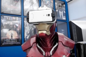
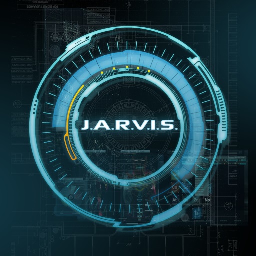
“Remember Tony Stark’s glass smartphone and transparent coffee table in the Iron Man movies? Or how about that gorgeous statue rendering of the Avengers in action at the end of Age of Ultron? You’ve got one company to thank for those sequences: Perception, a New York City-based visual design firm. It’s carved out a unique spot building forward-thinking design concepts for films and major tech companies, including the likes of Samsung, Microsoft and Ford. Perception’s work makes it clear we’ve moved on from the days when interface design was merely an afterthought for movies, and when few tech companies brought cinematic depth and emotion to their products. Now, there’s a sort of virtuous cycle of design, where movies lift from tech, and tech companies find inspiration in films.
After working with Marvel on a few of its direct-to-video animated films, the studio was brought in for its first major film project: Iron Man 2. At first, it was tasked with generating an interface for a massive screen at the Stark Expo early on in the movie. But as they were meeting with Marvel, they also heard some rumblings about a “glass phone” that Tony Stark would be carrying throughout the film.
Starting with that kernel of an idea, the Perception team mocked up their vision for a glass phone interface back at the office. As LePore tells us, they had a slab of glass cut out in the shape of a phone and used that to produce a demo video for Marvel. In the end, it was so well received that Perception wound up producing the interfaces for Stark’s bevy of gadgets, including his transparent coffee table and omnipresent household screens.
You’ll notice a common style throughout all of those interfaces: They’re dynamic and somewhat ostentatious, but at the same time they’re also surprisingly pragmatic. Basically, exactly what you’d expect from an egotistical playboy super genius who managed to build a suit of robot armor in a cave (with a box of scraps!). Perception isn’t only crafting pretty graphics; it’s also trying to give us some insight into the people who use those interfaces.
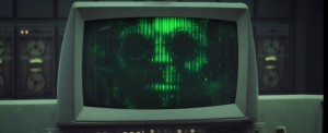
Iron Man 2 was an auspicious start for the company, as Marvel ended up tapping it for a variety of other projects. In Captain America: The Winter Soldier, Perception developed the windshield interface for Nick Fury’s car, as well as the montage sequence that (spoiler) revealed the depths of Hydra’s infiltration into world governments. It was also responsible for designing the elaborate supercomputer housing Arnim Zola’s personality, which was powered by old-school tape drives and displayed on green monitors.
“It’s almost like his soul was inside the machine,” LePore said. “To be able to do that in a way that was both low-fi, and make it feel he was taxing these systems as much as they could possibly handle. … It was a really interesting instance where we’re not just making UI that follows the personality traits of the person that’s using it, but the UI itself is the personality.”
Perception’s high-profile film work attracted a bevy of technology clients, most of which you’ve probably heard of. Samsung tapped it to work on some next-generation interface concepts, and the Korean company ended up using some of its ideas in its TouchWiz interface. They were even brought on to work on augmented reality concepts for HoloLens by Microsoft before Perception even knew what that product was. (Unfortunately, it can’t say what, exactly, it built for HoloLens.) And who can forget the Grid 10 tablet from Fusion Garage, whose only redeeming quality was an intriguing grid interface that Perception built from scratch?
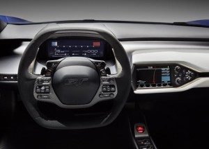
While much of the company’s tech contributions remain under wraps, Perception’s work has been featured in some recent high-profile announcements. Its dashboard interface sits at the heart of Ford’s 2017 GT supercar, as well as recent SpaceX streams. It’s also working with IBM, Intel, Mercedes-Benz and BMW, among others.
If you’ve ever heard anyone compare an interface to Steven Spielberg’s Minority Report, you’re probably well aware that there’s a pretty close relationship between techies and sci-fi films. LePore says that’s particularly true for the Perception crew. “There’s certainly a lot of people from the tech world who say, ‘I’d like to take what we saw in this film and make it a reality,'” he said. Similarly, Perception’s experience working with real-world tech helps to bring a dose of reality to films. Working with SpaceX, for example, comes in handy when designing aeronautical interfaces for movies.
It makes sense for movie studios to enlist extra design help, but it’s surprising that so many tech companies are doing the same. You can chalk that up to the rising emphasis on distinctive design. While Apple has always emphasized aesthetics, that hasn’t been a driving force for competitors like Microsoft and Samsung. So they look to companies like Perception for the equivalent of a creative booster shot. Just compare what Samsung’s TouchWiz UI looked like a few years ago to today, where it’s now influenced by Perception’s designs.
While there’s no shortage of motion graphics firms out there, for the most part they focus on film and television. Only a few dabble in technology projects. Perception’s ability to straddle those two worlds is a sign of our maturing design tastes. Most of us are carrying touchscreen computers in our pockets, and our mobile apps look years beyond the blocky desktop programs we used to rely on. Bad design simply can’t cut it anymore when we’re used to something better.”
Now there’s something cool to put on your resume: “Designed interface for Tony Starks’ Iron Man armors”!
Source: Engadget


